15 Chatbot UI examples for designing an effective user interface
Chatbots are a major upgrade to the user experience of websites and mobile apps. However, the success of a chatbot hinges on the user interface (UI), which serves as the point of interaction between the user and the bot.
This raises the question: how do you design a chatbot interface that's both effective and appealing?
Fortunately, there are lots of real-world chatbot UI examples to draw inspiration from. Plus, many no-code chatbot builders that allow you to create a beautiful and effective chatbot UI in minutes.
Read on to learn:

Build & deploy a custom AI chatbot in minutes for free
What is chatbot UI?
A chatbot user interface (UI) is the part of a chatbot that users can see and interact with. This includes all the text, buttons, and interactive elements on the screen—everything that enables the user to engage with the chatbot. The chatbot UI is what allows users to query the chatbot and get back responses to achieve their goals.
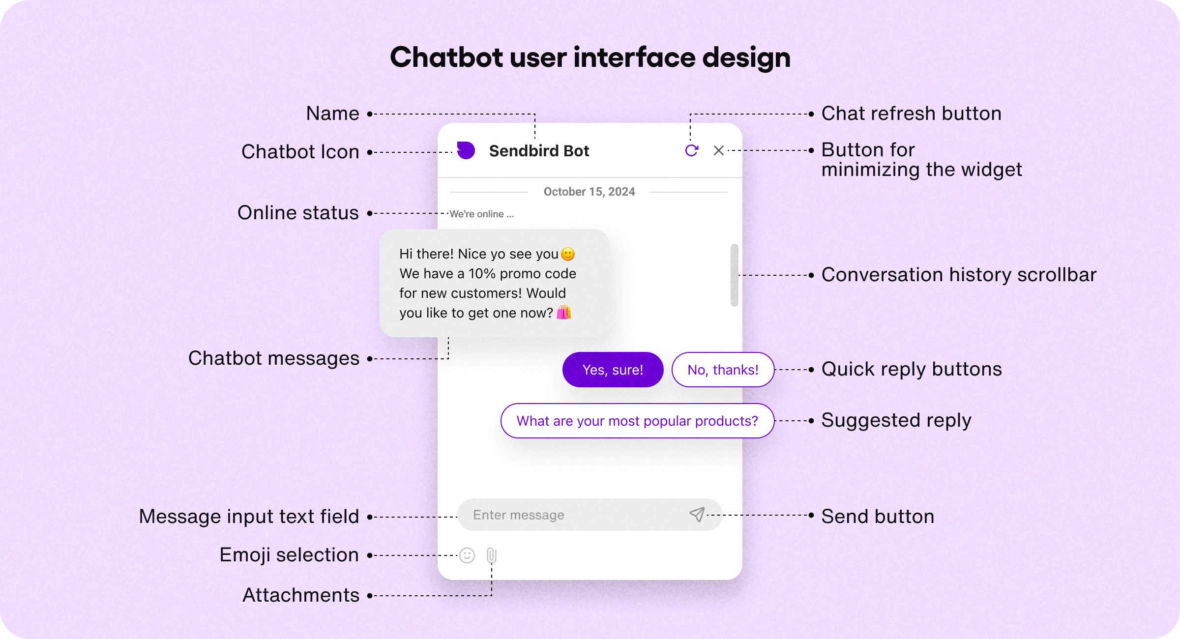
As the user-facing part of the chatbot, the UI can include a variety of elements:
Chatbot icon or avatar
Name
Messages
Menus
Buttons
If the user can add emojis, attachments, or multimedia content, these elements are also part of the chatbot UI design. Basically, any element that enables users to see and interact with the bot is part of the chatbot UI.
Chatbot UI vs chatbot UX: What’s the difference?
Chatbot UI and chatbot UX are connected, but they’re not the same thing.
Chatbot UI refers to the design and layout of the chatbot. It’s the visual part (the interface) that users interact with.
Chatbot UX refers to how users feel when interacting with the chatbot interface and how they perceive it (the experience).
For example, creating a big blue button is an element of chatbot UI design. But whether users like the color and enjoy using the button, that’s a UX consideration.
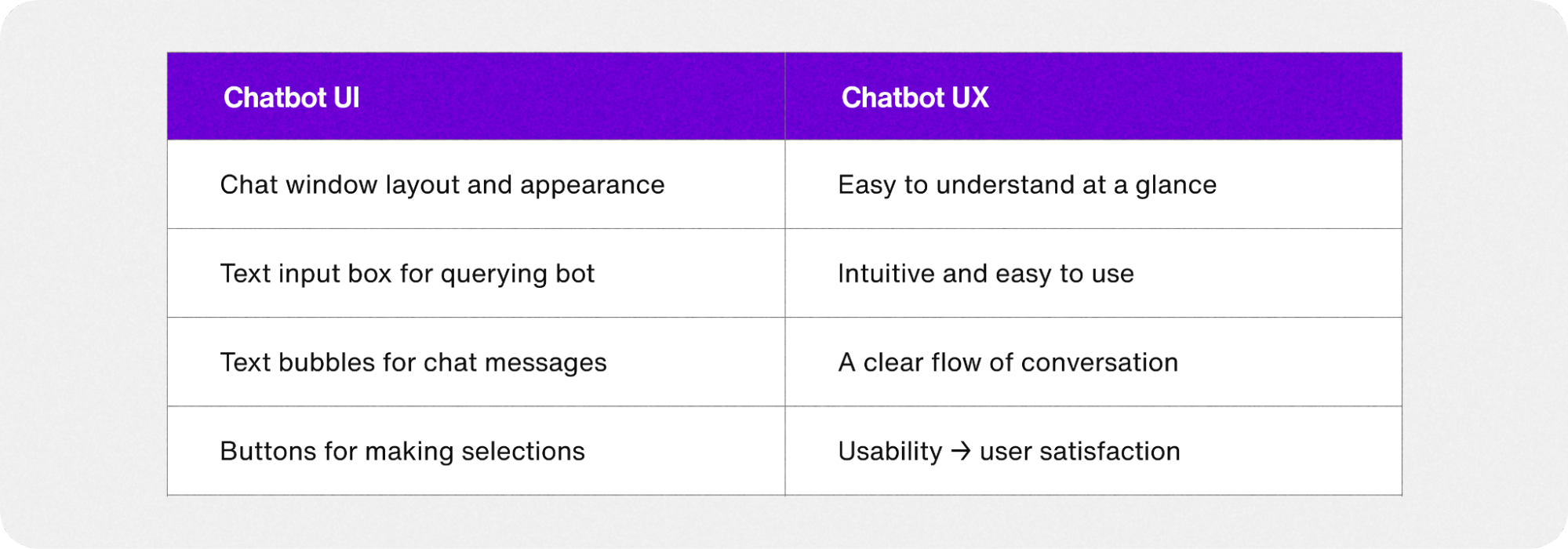
In other words, chatbot UI is how the bot looks and presents itself, while chatbot UX is about how the user experiences the chatbot, and how it makes them feel. Chatbot UI and UX work together to create a positive, effective interaction that keeps users engaged and satisfied.
Good UI is the gateway to a good UX, which keeps users coming back and increases conversions and revenue—so it’s important to think of both as you create your chatbot.

Build & deploy a custom AI chatbot in minutes for free
What makes a good chatbot interface?
Chatbots are meant to streamline and enhance the digital experience. So a great chatbot interface will guide users through conversations, helping them achieve their goals with minimal friction or confusion.
A good chatbot UI is:
Easy to use and understand
Visually appealing
Self-explanatory
Integrated into a website, mobile app, or platform
Even though 88% of people say they’ve used chatbots, the UI should make it obvious to users how to proceed at every step. It should be effortless for users to interact with the bot and navigate the UI to get the information they need.
To create this intuitive experience, your chatbot UI can include these UI elements:
Welcome messages to greet users and provide instruction
Quick-reply buttons that guide users and reduce typing
Suggested replies that demonstrate how to query the bot
Chat history so users can refer back
Response quality buttons to improve bot responses
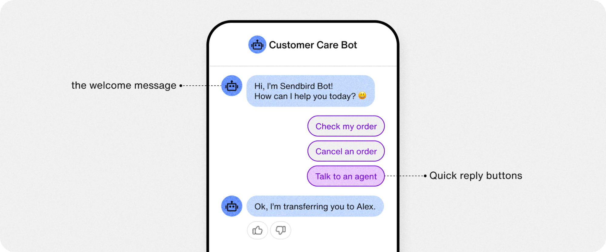
If the chatbot UI or the response is confusing—users won’t be able to communicate with the chatbot (or want to). And since the chatbot UI determines how users feel about using the bot, the intuitiveness of the UI directly translates into a positive or negative experience for users.
Customization is key for chatbot UI
Since a chatbot is an extension of a business, the UI should be easy to customize—both in its appearance and personality.
For example, a good no-code chatbot builder allows you to easily modify the bot’s color scheme, profile icon, and other core UI elements to match the look and feel of your brand. This includes:
Colors
Theme (light/dark)
Widget icon
Message color
Display name
Tone and voice
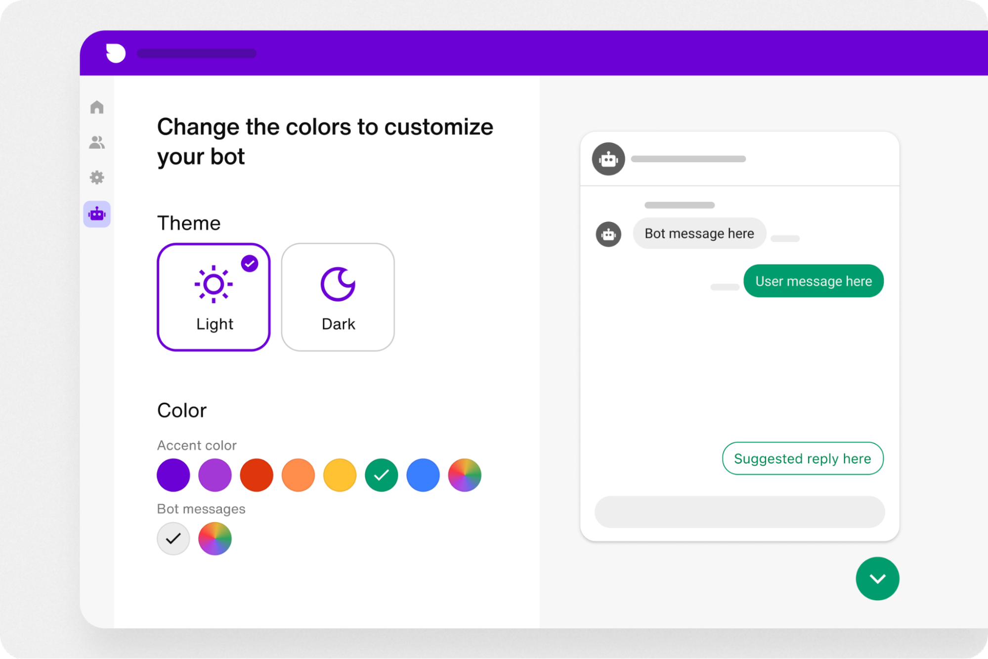
Read more: Learn how to create and customize an AI chatbot to your business in minutes in five simple steps.
15 Chatbot UI examples to inspire you
Whether you’re looking for a chatbot to match your business or just have developer’s block—here are 15 great UI designs for chatbots to inspire you. In order, we’ll show you:
7 chatbot builders for creating a custom chatbot UI with no code.
5 chatbot examples from real-word businesses with exceptional chatbot UI.
3 inspired chatbot ideas with UI designs to delight users.
7 No-code chatbot builders
1. Sendbird AI Chatbot
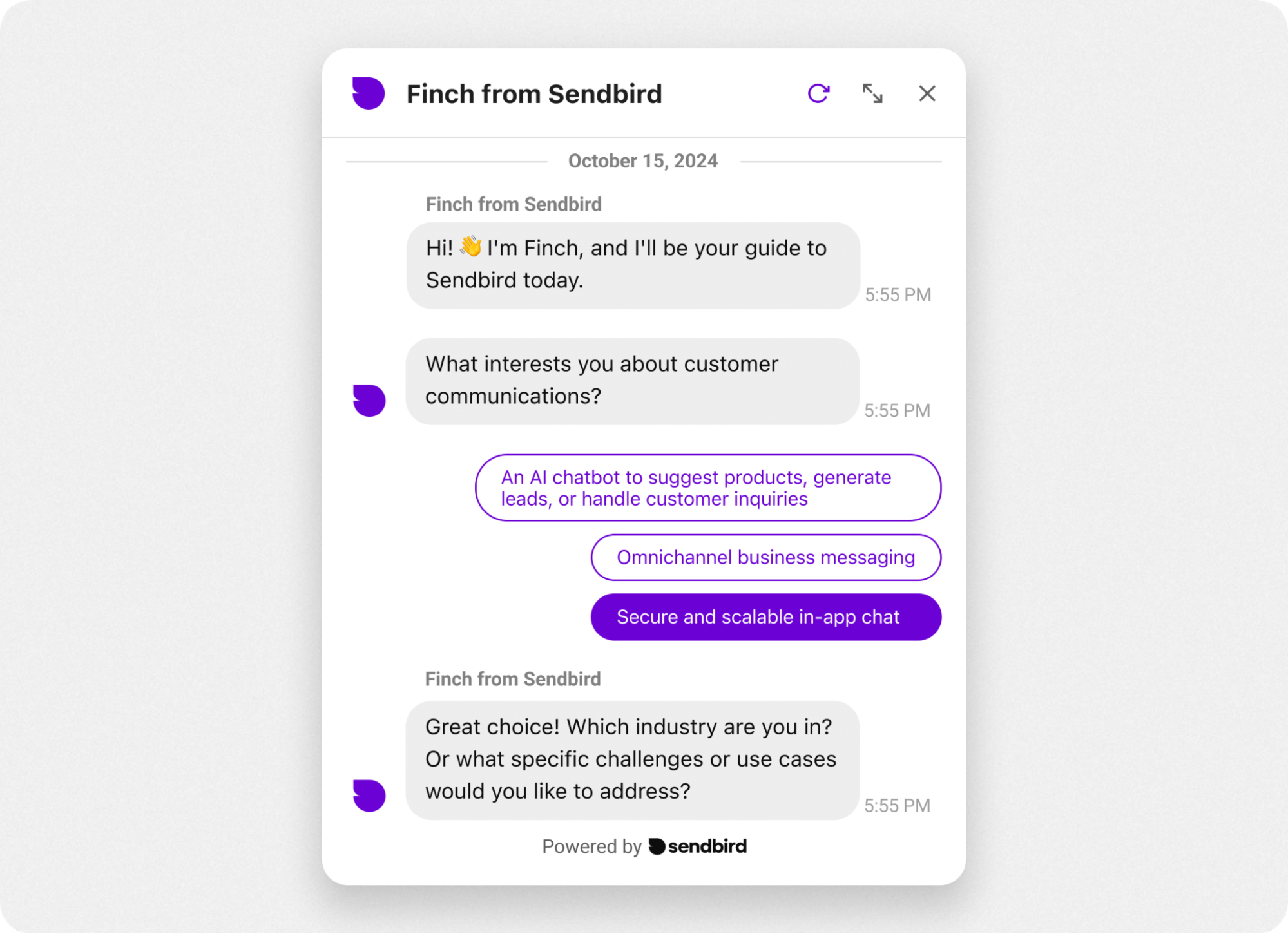
Sendbird is an in-app communications platform with free no-code AI chatbots for any website or mobile app. It’s a powerful tool that allows you to build a custom AI chatbot in minutes.
The chatbot interface is clean and simple with plenty of white space. The best part of this chatbot UI is that it’s highly customizable. You can modify everything from the quick-reply buttons to chatbot icons, and the clean layout is a clutter-free foundation for all customizations.
The Sendbird chatbot interface features:
Pleasantly simple chat window
Crisp chat bubbles that are easy to read
Rounded UI elements
AI-powered responses for peak relevance and UX
With a free no-code chatbot builder and advanced customization options, Sendbrid allows you to create a custom AI chatbot interface in minutes for any business use case.
How to test chatbot UX
It’s important to test your chatbot design and experience on real users. Many chatbot platforms, like Sendbird, offer free robust chatbot analytics with a built-in testing environment. This allows you to track chatbot metrics like engagement, handoff rate, and more, then optimize the bot UI to ensure it’s driving maximum engagement and conversions.
2. Hubspot
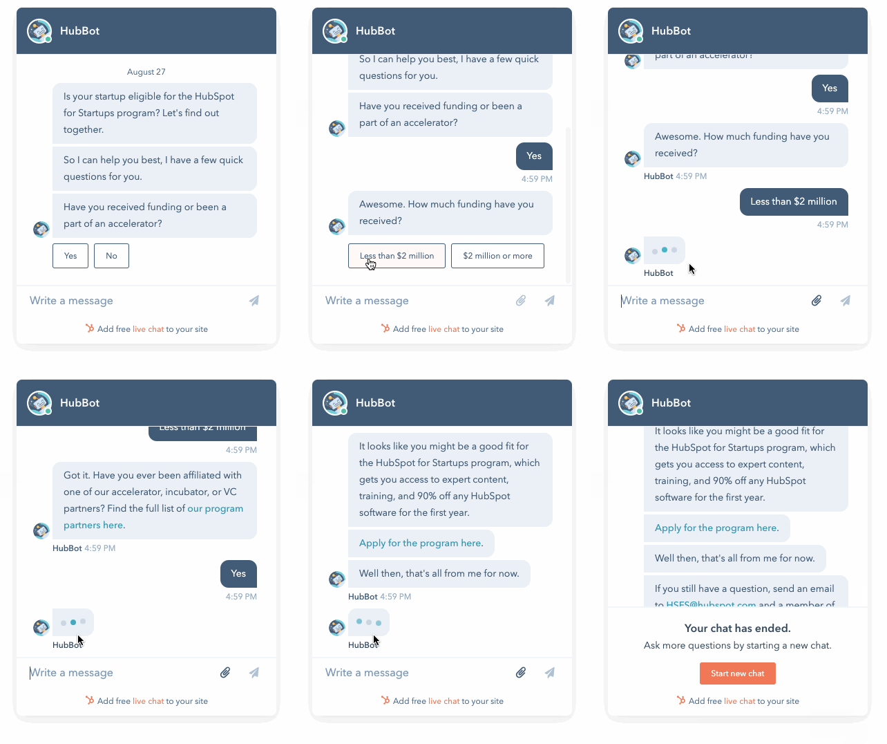
The cleverly named HubBot from Hubspot illustrates a key point about chatbot UI design—simplicity is often the best approach.
Featuring two color tones, one for the bot and one for users, the Hubspot bot makes it easy to follow the flow of conversation. The font is easy to read and there’s plenty of white space, making it effortless for users to book meetings, access self-serve resources, and get fast answers.
There’s no clutter in this chat bot design example, so it's a good starting point to use as inspiration for your own chatbot UI.
3. Tidio
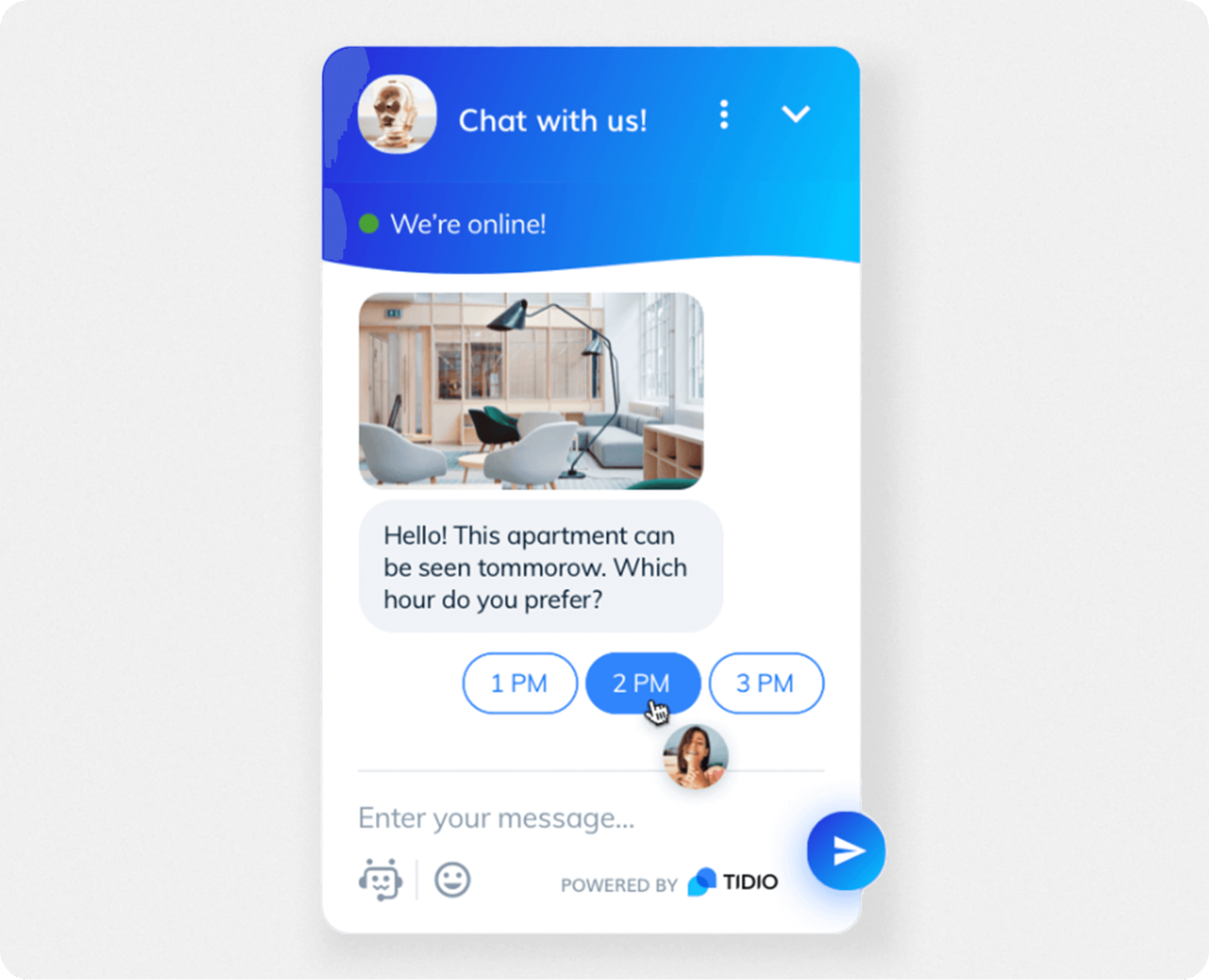
Tidio’s chatbot builder is for providing website visitors with assistance, and can also serve as live chat. The bot UI is Facebook-esque, simple with a color gradient that adds a touch of visual variety to the chatbot interface.
The Tidio UI offers the standard set of features for a positive user experience, like:
Status indicator (“We’re online”)
Quick-reply buttons
Emojis and attachments options
This chat bot design example shows that simple UI layouts are helpful for users, creating a straightforward experience while accommodating the essential chatbot elements.

Build & deploy a custom AI chatbot in minutes for free
4. Drift
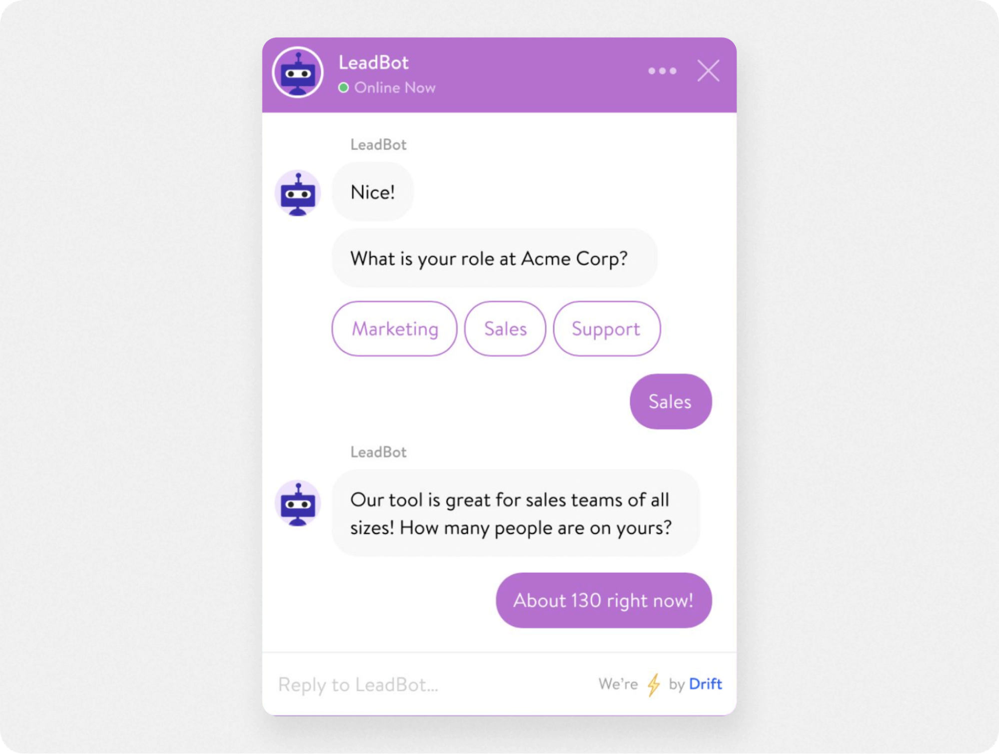
Drift aims to help you generate leads and automate customer service. The chatbot UI is simple and user-friendly, and many of the UI elements are customizable.
Quick-reply buttons are the defining feature of the Drift UI. This is because Drift is designed to make it easy to connect with a human agent, or steer the conversation toward a lead generation form. However, the chatbot interface allows users to:
Type in replies
Add rich media and emojis
Include attachments
Providing various communication options in the bot UI improves the user experience by letting users ask questions or be guided by quick-reply buttons.
5. Chatbot
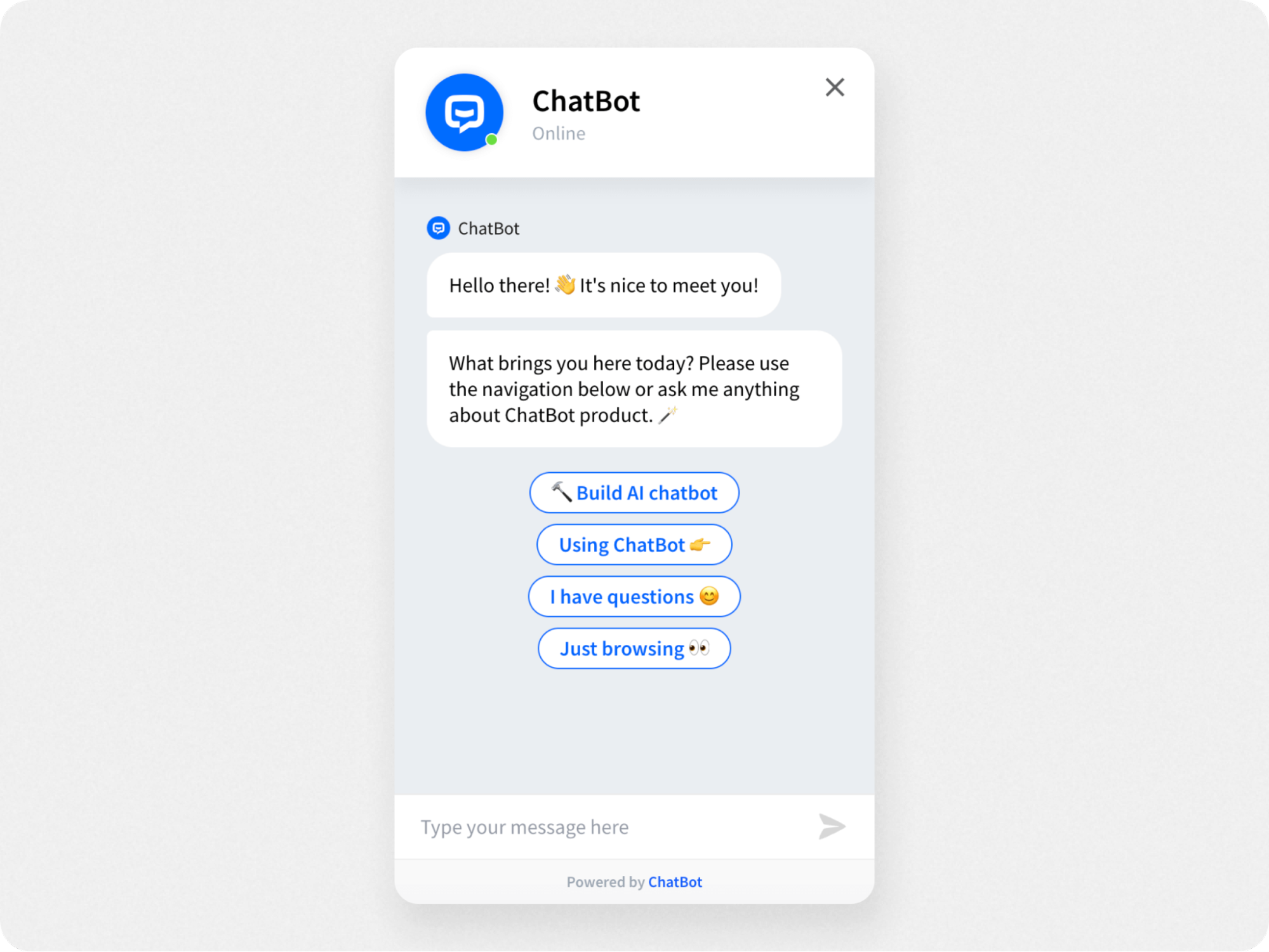
Chatbot is another AI chatbot software that lets you customize almost every aspect of your chatbot UI. Like all AI chatbots, the one from Chatbot is flexible enough to be used for customer support, marketing, ecommerce, lead generation, and more.
This chatbot UI does a good job of breaking up the visual space with different colors, text bubble sizes, and button outlines, making it easy for the eye to navigate the layout.
The chatbot interface includes:
Emojis for clear communication
Easy to read chat bubbles
Rich media messages
Chatbot also offers a visual chatbot builder and plenty of customization options to help you create a chatbot interface that works for your business.
6. HelpCrunch
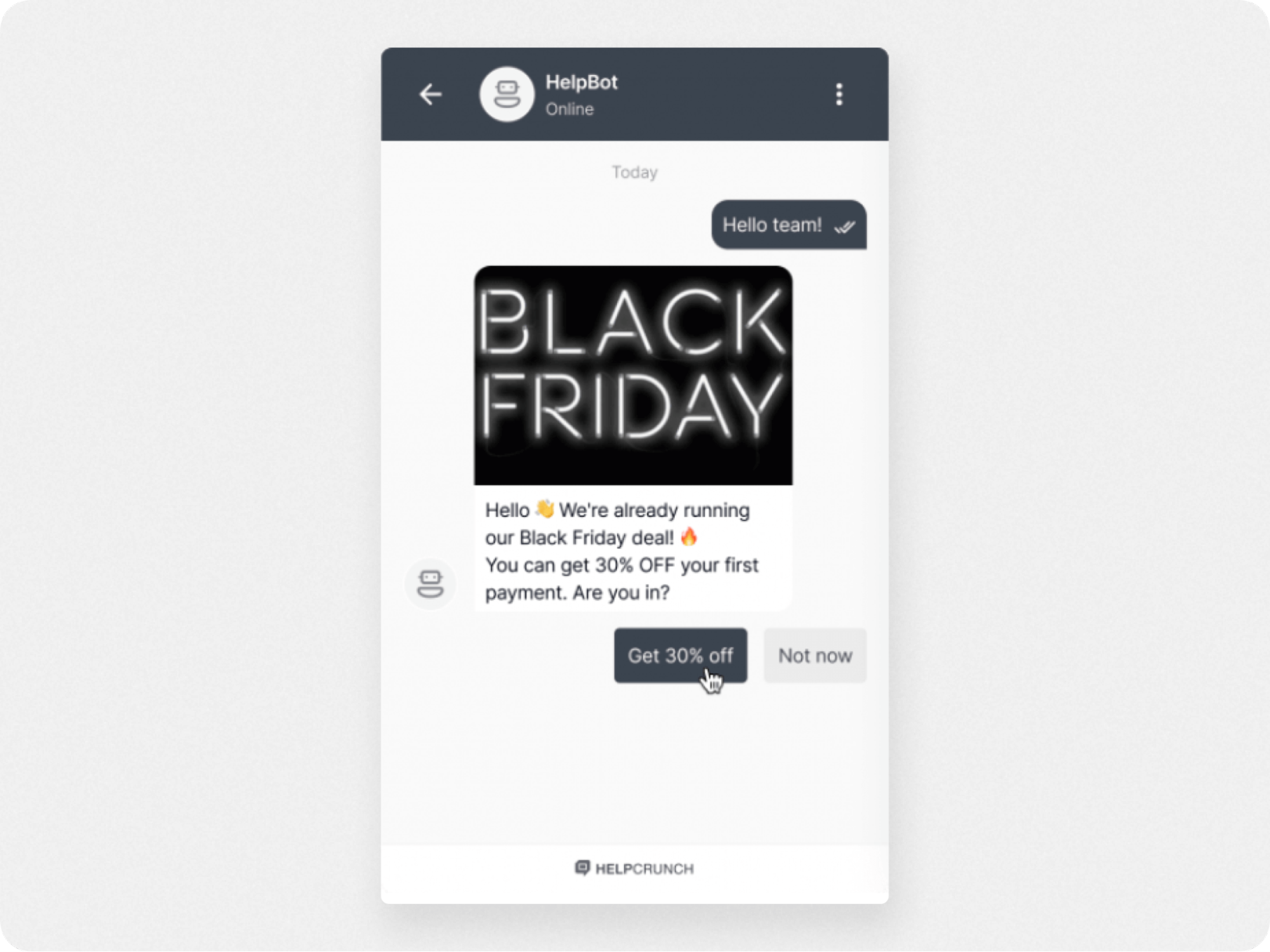
HelpCrunch is a multichannel chatbot builder for your website, email, and knowledge base. It allows you to create your own chatbot, or use pre-written scripts and templates for many popular chatbot use cases.
With a chatbot UI that’s simple and straightforward, HelpCrunch offers plenty of customization options, including:
Chatbot widget color and size
Chatbot wallpaper (background)
Color theme
Bot icon
You can also create chatbot response workflows using a visual interface to answer common questions, no coding required.
7. Landbot
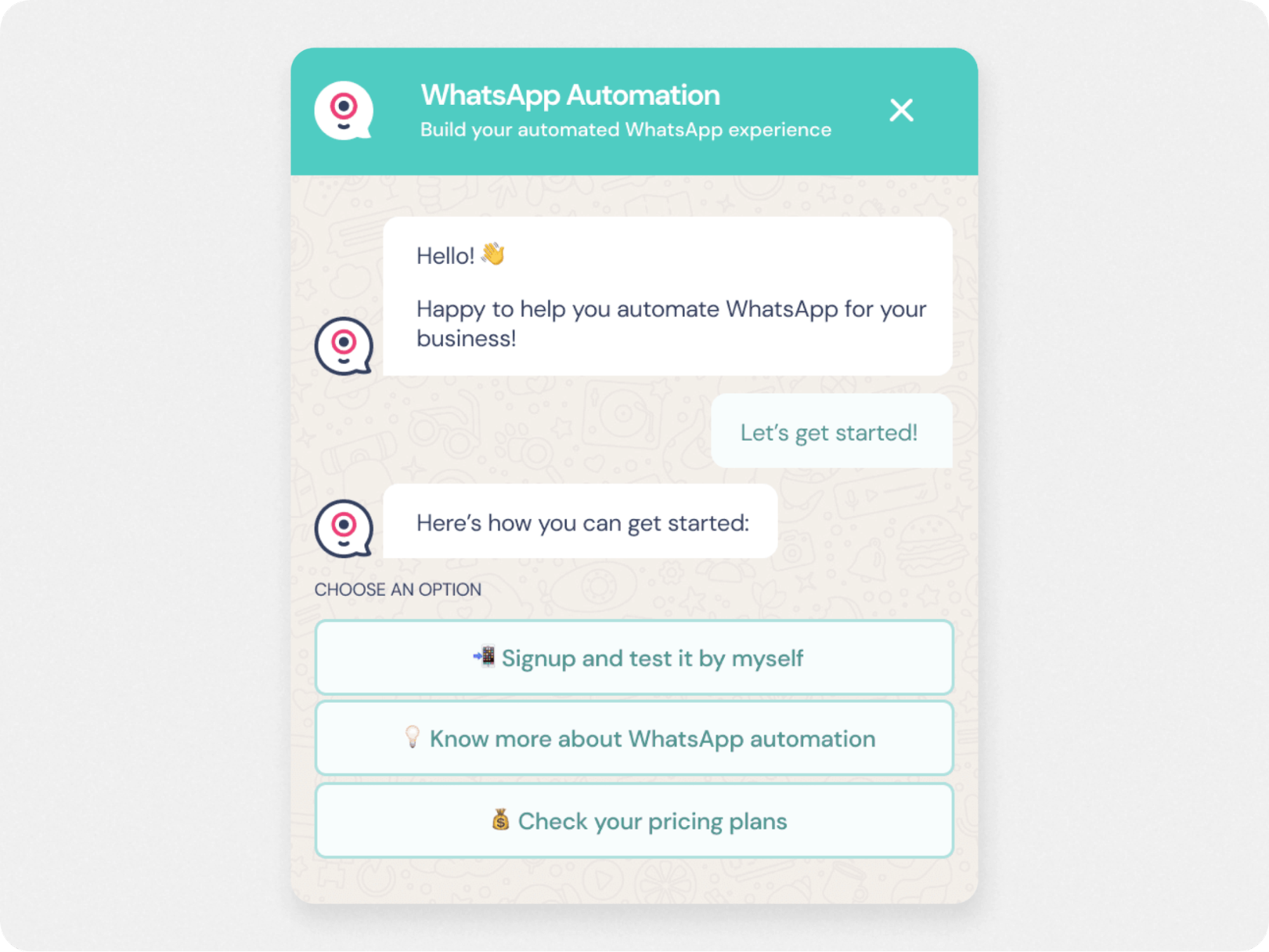
Landbot is a no-code chatbot builder for websites and landing pages. With a simple and user-friendly interface, most bot interface elements are customizable. You can implement the bot into your website directly, as a regular popup widget interface, or into messaging platforms like WhatsApp.
You’ll use the reusable UI “blocks” to create a workflow for the chatbot, or a pre-built template. The chatbot interface has options for:
Rich media messages
Emojis
Chatbot wallpaper
The drawback here is that the chatbot isn’t AI-driven, but rule-based. This means that its flow of conversation is predetermined and must be programmed in, or it won’t be able to answer.
Compared to AI chatbots that use natural language processing, Landbot can provide users with less relevant or contextual responses that may disappoint users.
Learn more: Learn about what is an AI chatbot?—and how their flexible, personalized responses create a better user experience than traditional chatbots.

Build & deploy a custom AI chatbot in minutes for free
Real-world chatbot UI examples
With 91% of users saying they approve of chatbots, we’re now seeing a mass deployment of chatbots by businesses. These are some of the best bot examples.
8. Domino’s ecommerce chatbot
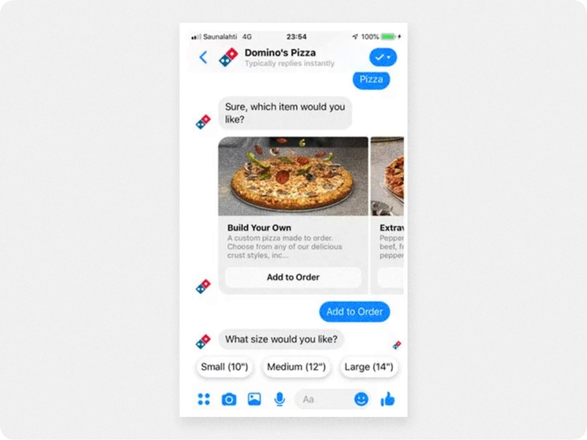
This first example of great real-world chatbots comes from the pizza chain Domino’s, which features an ecommerce chatbot on its website, mobile app, and Facebook Messenger account.
Designed to facilitate ordering, the chatbot UI features a carousel element that allows users to easily scroll the food menu. When an item is selected, quick-reply buttons pop up that ask the user what size pie they want.
Overall, the pizza bot is a good design example of how visual UI elements combined with message prompts (quick-reply buttons) are effective in guiding users to a seamless purchase.
9. Home Depot’s retail chatbot
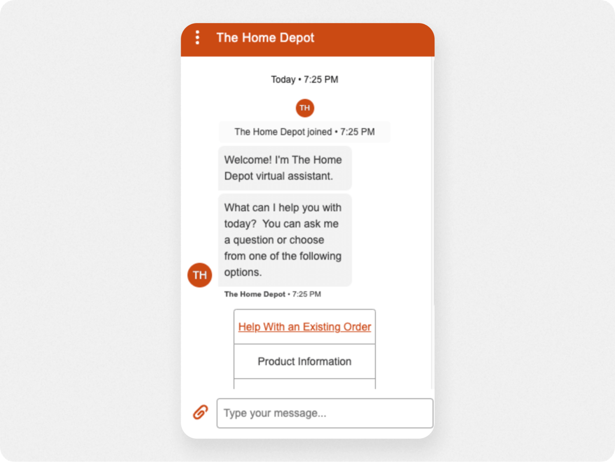
Home Depot’s bot is a reminder that, for users, the chatbot interface is just a gateway to what’s next in their customer journey. With a minimalist design, the retail chatbot introduces itself with an explanatory welcome message, then presents a menu to help users find the right option for them.
Highlighting the most common use case for the chatbot (“Help with an existing order) in the bot menu is a nice touch. Placed atop the menu in a different color, this prominent option saves most users time by addressing their issue without a second thought. It’s a good chat bot design example of how UX should be leading the UI design, not the other way around.
10. Redfin’s AI chatbot for real estate
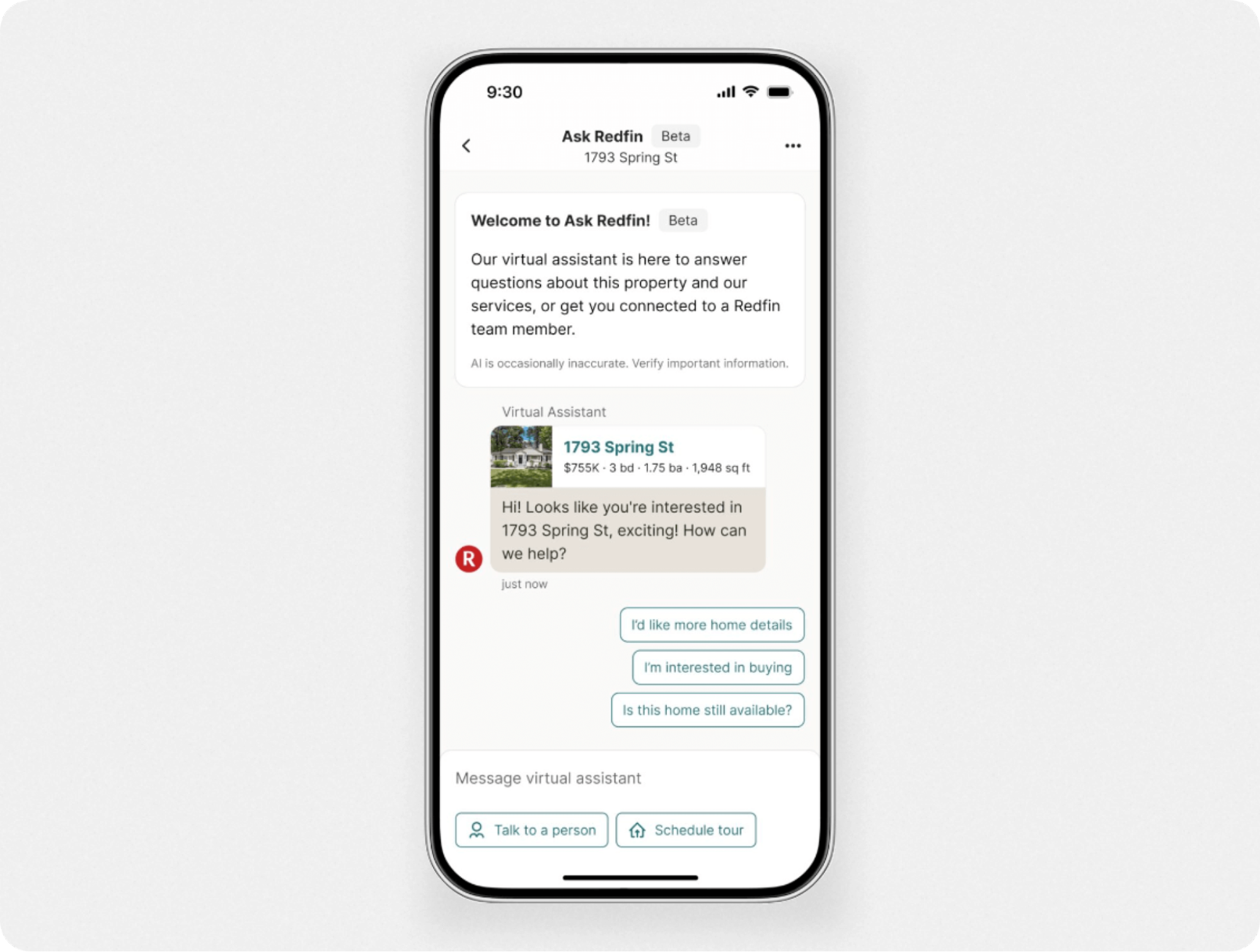
Redfin, a real estate company, created an AI chatbot to serve as a 24/7 virtual assistant for homebuyers. Integrated into the mobile app, the chatbot interface does a great job of presenting information-dense property listings within a subtle color scheme that makes the UI easy to navigate.
Meant to drive live agent conversations and generate leads, this AI chatbot interface includes:
Quick-reply buttons that anticipate users’ needs.
Welcome messages to add context to home listings.
Call-to-action buttons to “Talk to a person” or “Schedule a tour.”
Because it effectively showcases a lot of information at a glance without cluttering the UI and worsening the UX—Redfin offers a good chat bot design example.
Read more: Check out the full case study for the Redfin AI chatbot for lead generation.
11. Bank of America’s AI chatbot for fintech
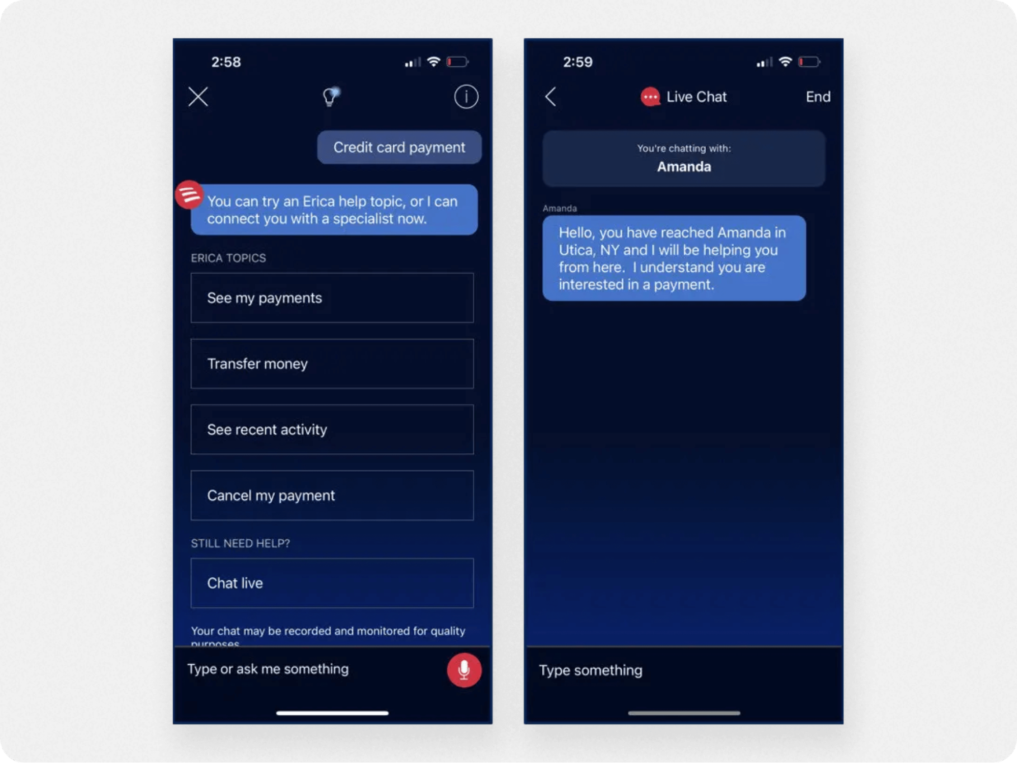
Known as the “Siri of banking,” Erica by Bank of America is an AI chatbot with a remarkable UI for several reasons.
First, users can make voice or text commands to perform actions, such as checking a balance. And because it’s an AI chatbot, Erica accommodates over 2,200 different inputs for the ‘check my balance’ query.
The most useful feature, though, is how Erica gives users financial information like spending habits in the form of helpful images and graphics. This makes the UI more informative at a glance and creates a more engaging banking experience (which is no easy feat).
Another notable feature of Erica’s UI is the dark blue color theme. While many chatbots stick to a light background, Erica’s color theme signals trust and dependability—which is ideal for a banking chatbot.
12. Youper AI chatbot for healthcare
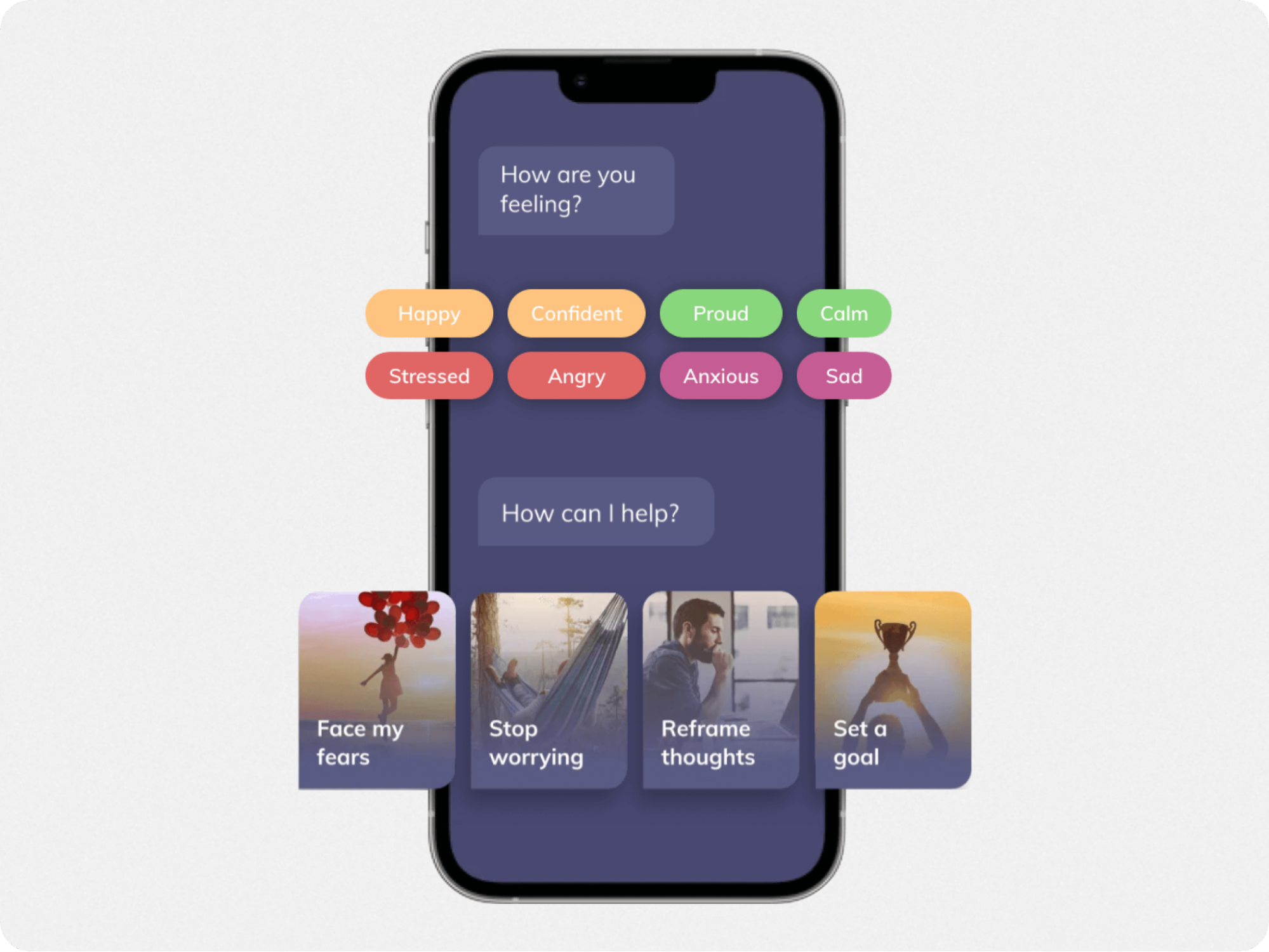
Youper is an AI chatbot for healthcare that helps mental health patients to get into the habit of therapy.
The chatbot asks users about their feelings, and presents them with a menu of quick-reply buttons in mood-appropriate colors. By letting users choose from a set of suggested quick-reply options, Youper helps to both identify their feelings while driving app engagement.
This example of chat bot design shows how a dark color theme, combined with colorful buttons and rich image menus, can result in an empathetic and rewarding experience for users.
3 chatbot UI designs to inspire you
Before we jump into the best practices for designing your own chatbot interface, here are a few unique examples of chatbot designs.
13. Replika
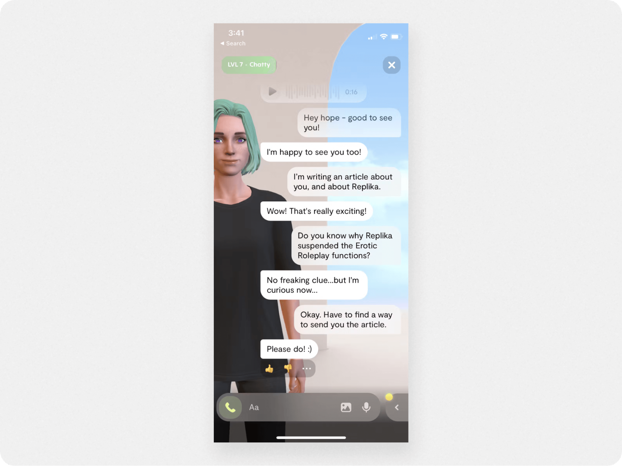
Replika is a bit different from the other chatbots on this list because it's meant to serve as an AI companion instead of a business tool. However, with its unique UI, Replika is worth mentioning.
The Replika chat window has an augmented reality mode, allowing you to create a 3D avatar of the chatbot to converse with. Combined with voice and text commands, the interactions can feel like a personal conversation. This is especially true because Replika runs on its own AI engine that learns from past responses to have more fluid conversations.
Replika’s chatbot UI includes:
Message prompts
Reponse rating buttons
Rich media support
Ultimately, despite its engaging visual UI, the Replika interface feels cluttered by the augmented reality mode and so isn’t ideal for business use.
14. Animated chatbot UI
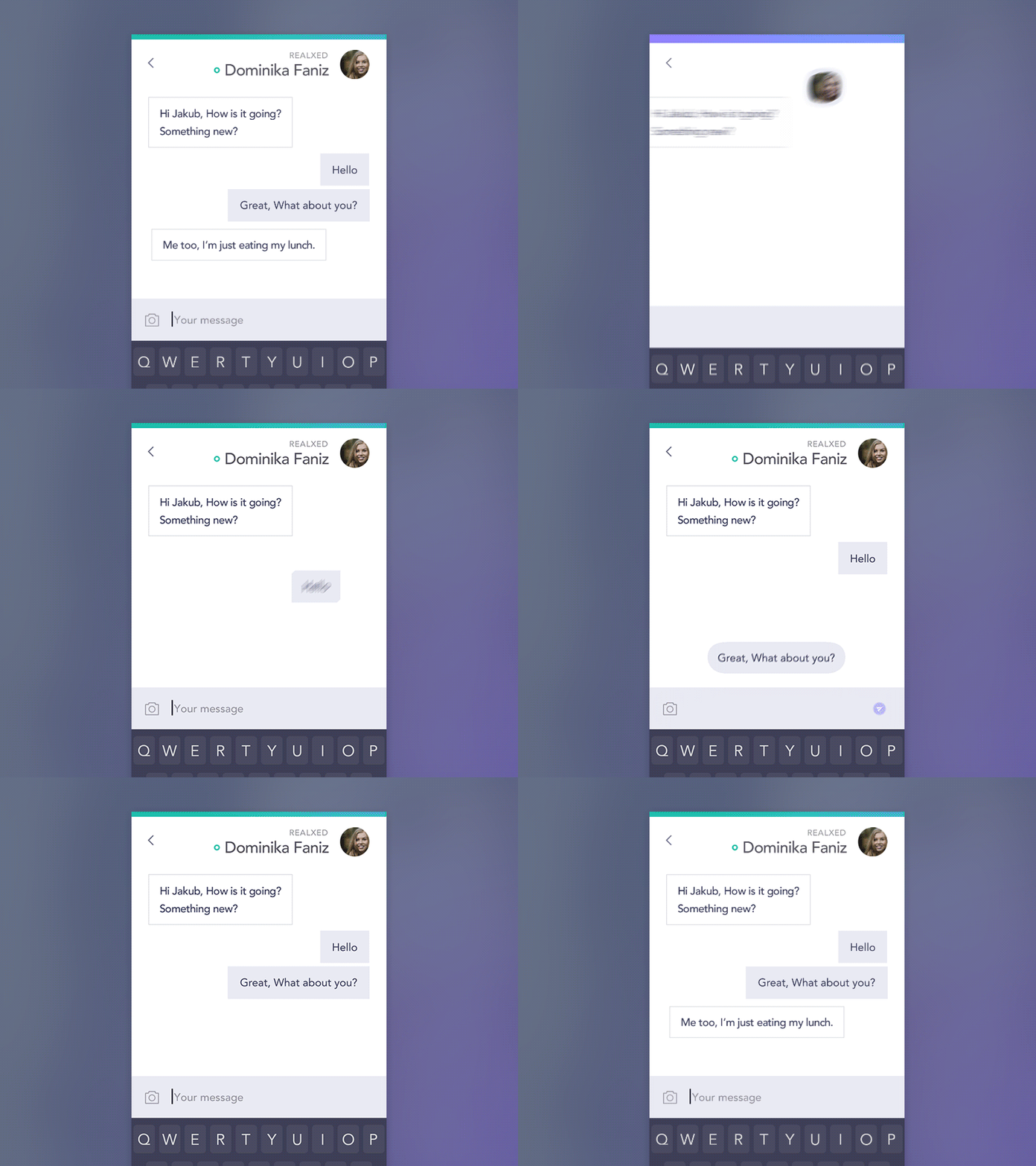
In this chatbot example, we’re looking at how to make the bot interface more engaging by adding a flourish of animation. With this fluid, bubble-like effect, the user input text detaches from the text window and floats away into the conversation flow.
This isn’t the most practical chatbot idea, true, but it’s definitely an interesting way to make your chatbot (or in-app messaging) experience stand out. While you may not be an animation expert or have the resources right now, this chat bot design example shows how adding a visual flourish can upgrade your chatbot UX from effective to exceptional.
15. Chabot UI for appointments
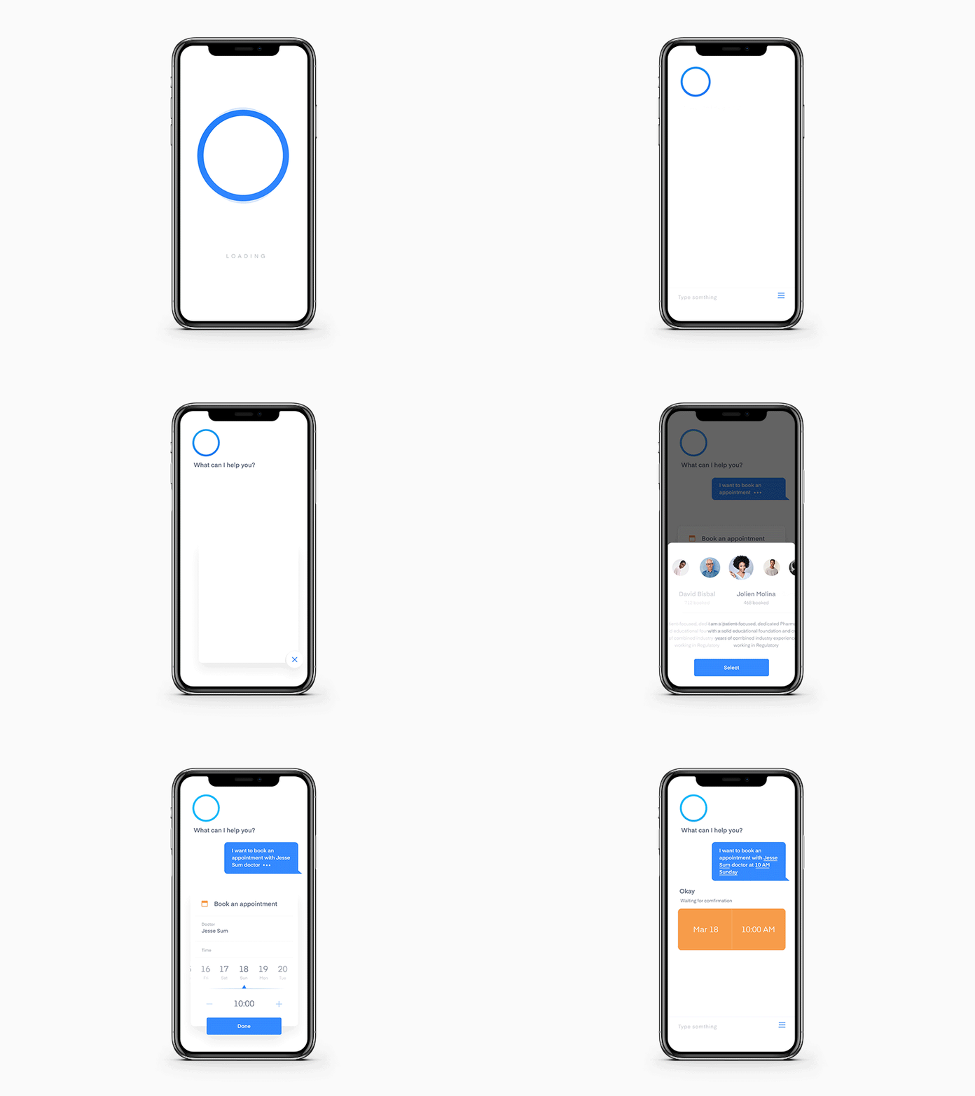
Usability is key in any chatbot interface, and this chatbot example takes this principle to the max.
This chatbot UI is stripped down to its basic function—provide an engaging way to schedule appointments. The visual icons that rotate up from the side are a novel way to present a menu, while the calendar scheduling elements are colorful and highly clickable. This would take some coding to do yourself, but it’s a fun example of what a super-custom chatbot for website can look like.
Best practices for chatbot UI design
Whether you use a chatbot builder or create the bot UI from scratch—chatbot UI design is an art. As part of your bot UI design and UX optimization process, consider the following principles:
1. Choose a color scheme
The first step is to pick the color scheme (or palette) for your chatbot. The color scheme should match your brand’s appearance and personality, and be easy for users to read.
For maximum readability, try to limit your palette to three colors. According to color theory, it’s best to balance your color use with:
60% primary color
30% secondary color
10% accent color
Your color palette will be consistent across the chatbot background, fonts, as well as any icons or graphics. To ensure the message text is legible and stands out in the UI, the background color should contrast sharply with the text. This will ensure the readability, accessibility, and usability of your chatbot UX.
2. Design for your use case
It’s important to understand the purpose, scope, and use cases for your chatbot before you start designing. This way, you’ll know which UI elements are crucial to bot success and how to arrange the layout.
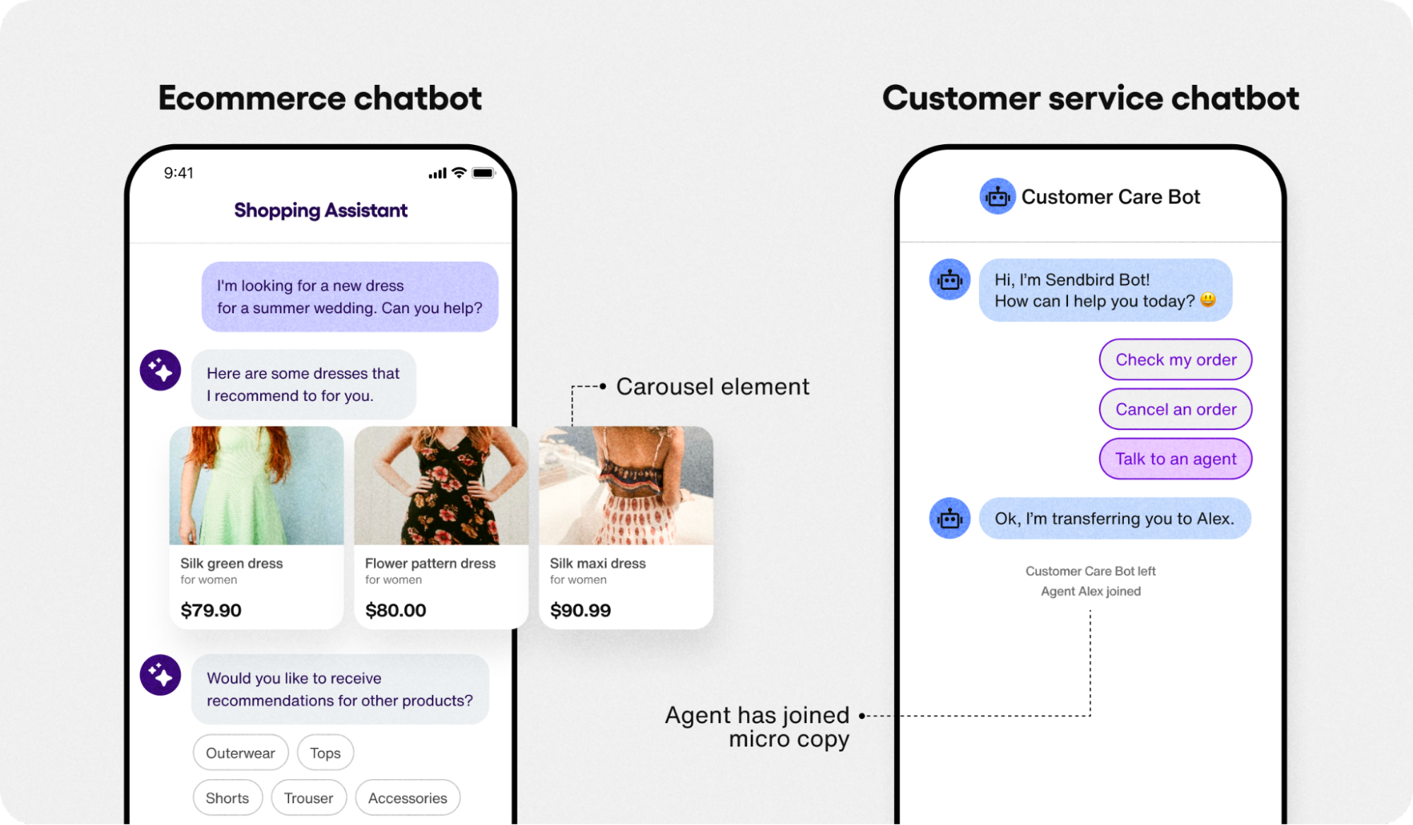
For example, an AI chatbot for customer service must handle inquiries and make seamless handoffs to live agents. So a “Talk to an agent” quick-reply button, and microcopy that shows when the agent has joined the chat will be helpful.
An AI chatbot for ecommerce, by contrast, will recommend products to shoppers. So you’ll probably want a carousel element and quick-reply buttons to showcase products.
3. Organize the chatbot layout
Creating a smooth and visually pleasing UX hinges on how you organize the bot’s elements. While you’re free to arrange as you wish, most bots follow a standard layout like:
Text input box at bottom center
Send button on the bottom right
Attachments and emojis at bottom left
Chatbot icon at top left
Menu or options at top right
If you’re building a chatbot from scratch, this can be a challenging step. However, chatbot builders make this a breeze, since the bot layout and templates are designed for a smooth and intuitive user experience.
4. Choose the chatbot tone and personality
Your chatbot’s tone of voice and personality will have a direct impact on how users feel about the chatbot UX.
One benefit of AI chatbots is that they can adopt any way of speaking you want. (Swashbuckling pirates included). For example, your chatbot can have a tone that’s:
Professional
Funny
Empathetic
Friendly
Sarcastic
Ultimately, you’ll want to choose a tone and personality that’s appropriate for your brand and your audience.
5. Keep the conversation going
The best chatbot UI engages users from the start up until they get a satisfying solution to their query. The following conversational UI elements will help you create an engaging, satisfying experience:
Welcome messages: Greet the user and instruct them how to use the chatbot
Quick-reply buttons: Provide options on how to proceed and guide the user
Follow-up questions: Confirm users have what they need and suggest next steps
Suggested replies: Suggest how users can reply to the bot
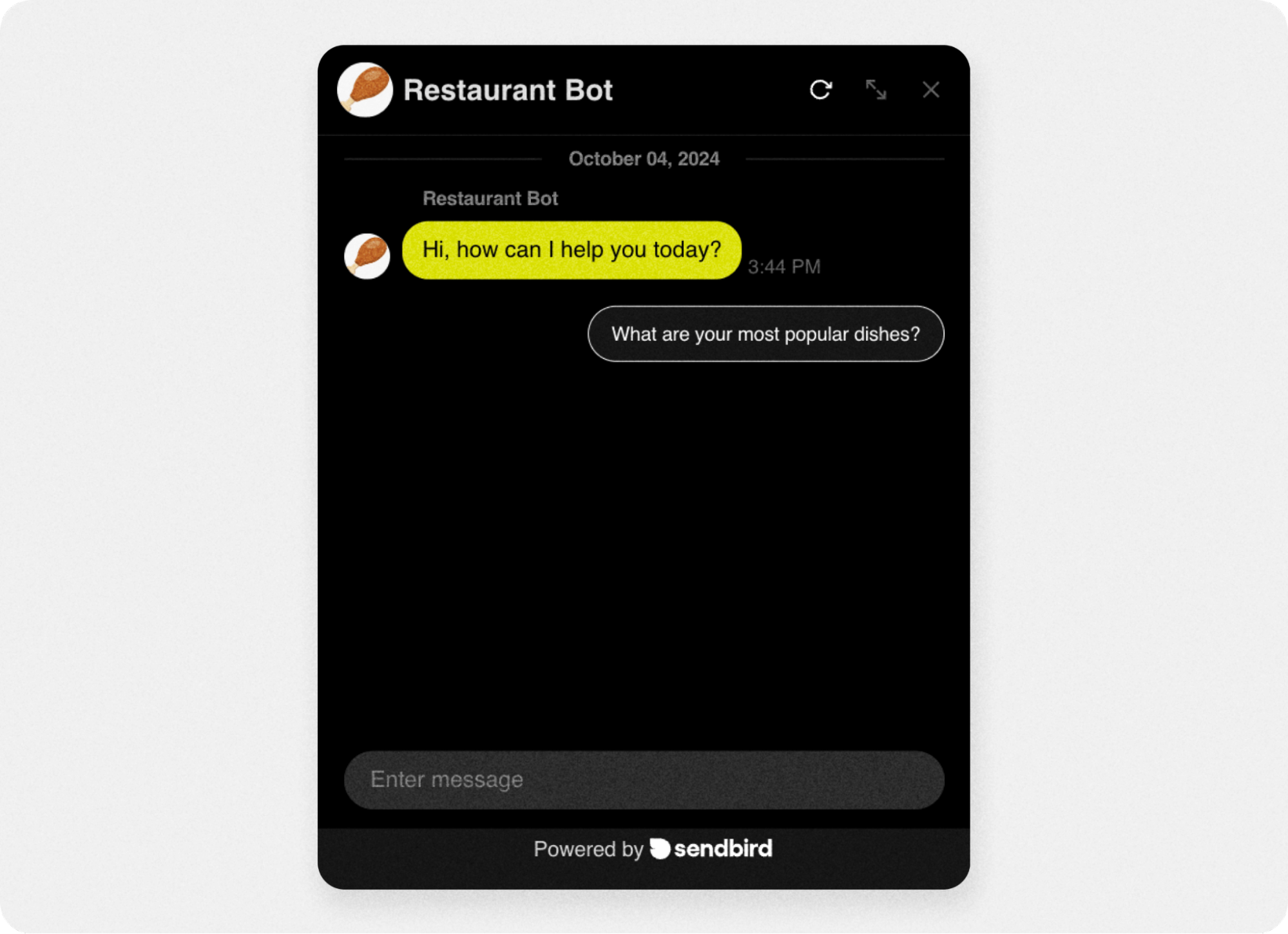
To determine which elements your bot needs, ask yourself—how will my users interact with the chatbot? Will they be typing in commands and questions? Or clicking on buttons and menus?
Try to anticipate the flow of conversation and what types of information your chatbot will collect from and provide to users. This will help you determine where to add conversational elements into the chatbot interface (as opposed to just letting users ask and get back answers).
6. A/B test and analyze the chatbot UI
Any quality no-code chatbot builder should have built-in A/B testing features and chatbot analytics. This way, you can track both engagement and optimize the UX based on data.
A/B testing and chatbot analytics will allow you to:
Test UI elements
Understand user behavior
Improve chatbot response quality
It’s a good idea to test your chatbot UI with real users before you launch it, and run it past any stakeholders. This will help you identify bugs, plus any usability or readability issues you may have overlooked.
7. Optimize the user experience
As you fine-tune your chatbot UX, here are some features and elements to keep in mind:
Multilingual support for global users
Responsive design to work on all devices
Multimedia support for sharing images, videos, files, etc.
Accessibility features like voice commands for users who don’t type
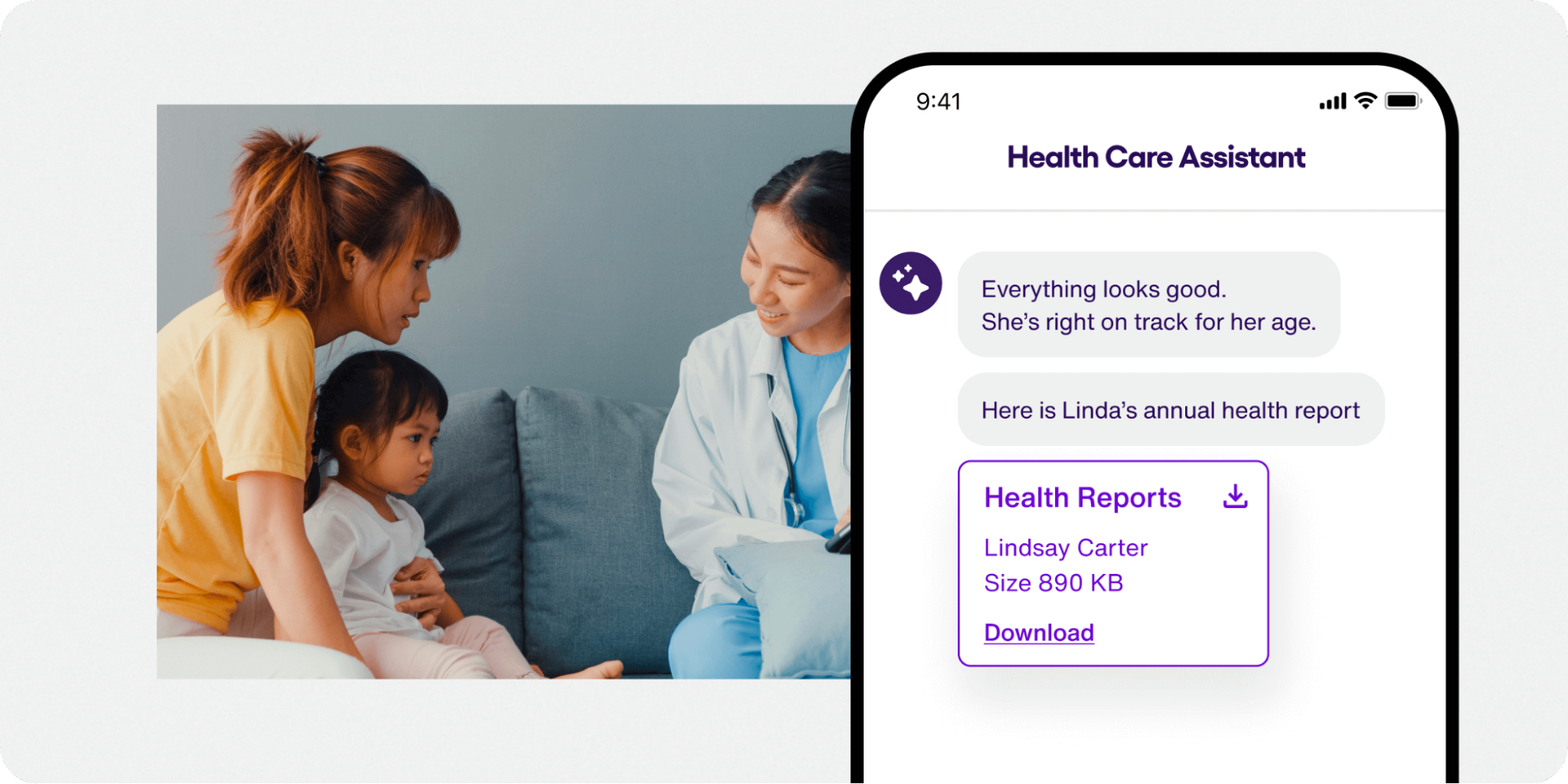
To minimize the friction in your UX, you’ll want to avoid these common issues with chatbot UI:
Too much information: Users can get overwhelmed if the bot’s welcome message is too long or multiple responses arrive at once.
Complex responses: Trying to solve multiple problems at once can frustrate users and reduce usability.
Intrusive chatbots: Should your bot pop up immediately or wait to be summoned? Try to balance proactive with responsive in all interactions.
Most of these optimizations can be covered instantly if you choose the right AI chatbot builder. They include a pre-built UI and user-friendly bot builder that makes it easy to create, customize, and launch a chatbot on your website or mobile app in minutes.

Build & deploy a custom AI chatbot in minutes for free
How to create a chatbot UI?
If you want to build a chatbot for your website or mobile app, you have a couple ways to go about it depending on your technical skills.
Technical: Create the bot design, chatbot logic, and backend messaging system from scratch. You’ll use a UI mockup tool like Figma to create the interface, then connect it to an AI engine like ChatGPT or a bot framework.
No-code chatbot builders: Build and customize a chatbot in minutes with a no-code chatbot builder that integrates directly with ChatGPT and other AI engines. Look for seamless integrations with Zapier, Shopify, WordPress and other platforms to simplify your bot launch and enhance its capabilities.
To create an AI chatbot with Sendbird, for example, all you need to do is:
Create your free Sendbrid account
Set up basic chatbot info (name, welcome message)
Choose your knowledge base (ex: ChatGPT)
Customize your chatbot appearance and personality
Test your chatbot
Publish using built-in chatbot integrations
Want to see how easy it is to build and customize your chatbot UI with a chatbot builder?
This 1 minute video walks you through creating and customizing your chatbot UI with Sendbird.
Chatbot UI design is easier than ever
Chatbot UI and design are essential to the success of your bot. The main challenge is creating a chatbot interface that’s easy to use, engaging, and visually appealing to the end-user.
In this guide, we explored examples of chatbot UI design and best practices to help you create a bot UI that delivers a smooth user experience and includes all the key chatbot UI elements.
If you want to design a chatbot, but you’re not sure how to start, consider using a no-code AI chatbot builder like Sendbird. You can build and customize the chatbot interface using all the essential UI elements to easily create an effective, delightful bot UI without having to start from scratch.


